Simulating data
simulating_data.RmdIn this vignette, we demonstrate how to simulate certain types of data to be used in analyses. Simulating data under certain assumptions is an important feature that allows hypothesis testing, proving useful in a number of scenarios. There are three different simulation functions implemented under the estimateR package:
-
simulate_infections(): used to simulate a series of infections through time, under a certain reproductive number and serial interval -
simulate_delayed_observations():used to simulate a series of delayed observations from a given series of infections -
simulate_combined_observations(): used to simulate combined observations. Combined observations are obtained in a real-life scenario when, for some of the cases reported (that have been affected by the full delay since infection; eg. the delay between infection and symptom onset and the delay between symptom onset and case report) the date of symptom onset is also known (only affected by the first delay; eg. the delay between infection and symptom onset). Cases counted as a “partially-delayed observation” (in thepartially-delayedcolumn of the result) are not counted again as a “fully-delayed observation” (in thefully-delayedcolumn of the result).
We will exemplify use cases for each one of them.
Simulating a series of infections
Simulating epidemics with diferent reproductive numbers
Let us assume we need to generate two different infection time-series, one corresponding to an epidemic with a reproductive number of 1.4 and one with a reproductive number of 1.8. We will introduce a constant import of 5 cases per day for the first week to ensure the epidemic does not die off.
  Rt_1 <- rep(1.4, 30)
  Rt_2 <- rep(1.8, 30)

  imported_infections <- c(rep(5, 7))

  simulated_infections_1 <- simulate_infections(
    Rt = Rt_1,
    imported_infections = imported_infections)

  simulated_infections_2 <- simulate_infections(
    Rt = Rt_2,
    imported_infections = imported_infections)
If we plot the two trajectories, we can observe the number of infections in the case with a Re of 1.8 increases faster, as expected. We assume the first date is the 1st of December.
results <- data.frame(
  date = seq.Date(from = as.Date("01/12/2020"), length.out = length(simulated_infections_1), by = "day"),
  small_re = simulated_infections_1,
  big_re = simulated_infections_2
)

ggplot(results, aes(x = date)) +
  geom_line(aes(y = small_re, color = "Re = 1.4"), lwd =  1.1) +
  geom_line(aes(y = big_re, color = "Re = 1.8"), lwd =  1.1) +
  scale_x_date(date_breaks = "10 days",
               date_labels = '%b\n%d') +
  ylab("Number of infections") +
  xlab("") +
  labs(colour='Simulated infections') +
  theme(legend.position="top")+
  theme_bw()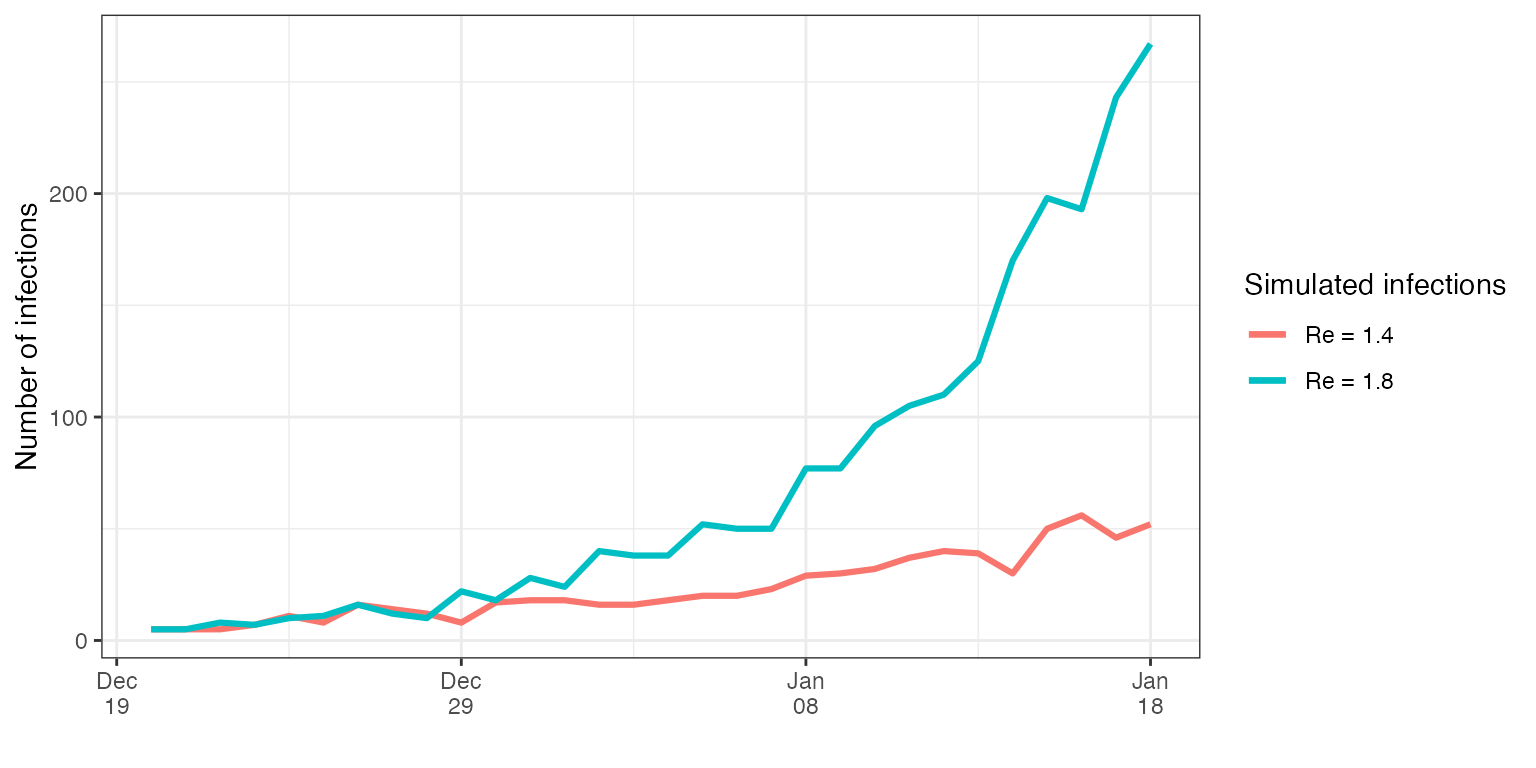
Comparing the effect of imported cases
Let us assume the question of interest is comparing the impact that imported infections have on the total case number, assuming the same evolution of the reproductive number.
The first step would be to define the desired reproductive number evolution in time, under which we want to simulate the data.
The next step is to decide the two series of imported infections, whose influence we want to compare. In both cases, a constant import of 5 cases per day for the first week will be assumed, to make sure the epidemic does not die off. After one week, one dataset will have no more imports, while the other will keep the 5 cases/day import rate.
We will assume the same default mean and standard deviation of the serial interval of the epidemic in both cases, and we will use the simulate_infections function to perform the final infection simulations.
  simulated_infections_1 <- simulate_infections(
    Rt = Rt,
    imported_infections = imported_infections_1)

  simulated_infections_2 <- simulate_infections(
    Rt = Rt,
    imported_infections = imported_infections_2)
The final step is plotting and analyzing the results. We assume the epidemic started on the 1st of December.
results <- data.frame(
  date = seq.Date(from = as.Date("01/12/2020"), length.out = length(simulated_infections_1), by = "day"),
  imports = simulated_infections_1,
  no_imports = simulated_infections_2
)

ggplot(results, aes(x = date)) +
  geom_line(aes(y = imports, color = "Imported cases"), lwd =  1.1) +
  geom_line(aes(y = no_imports, color = "No imported cases"), lwd =  1.1) +
  scale_x_date(date_breaks = "10 days",
               date_labels = '%b\n%d') +
  ylab("Number of infections") +
  xlab("") +
  labs(colour='Simulated infections') +
  theme(legend.position="top")+
  theme_bw()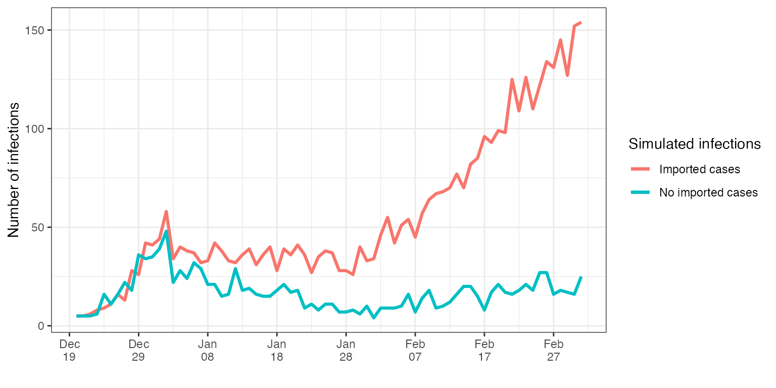
As expected, the case where imports did not stop, ends up to have substantially more infections with the same reproductive number.
Simulating delayed observations
Let us assume we want to simulate delayed observations of one of the infection series obtained above.
Constant delay
In this example, we will simulate symptom onset data, assuming that the delay between infection and symptom onset follows a constant gamma distribution. The gamma distribution described below has a mean of 4.16 and a standard deviation of 8.94, resulting in a wide distribution. This was chosen as such to make the results of simulating the delayed observations apparent.
  shape_incubation <- 3.2
  scale_incubation <- 5
  delay_incubation <- list(name = "gamma", shape = shape_incubation, scale = scale_incubation)
To make the data more realistic, we will also add some gaussian noise with a standard deviation of 0.5.
noise <- list(type = 'gaussian', sd = 0.5) The last step is to generate the simulated delayed observations, using the simulate_delayed_observations function.
  simulated_observations <- simulate_delayed_observations(
    infections = simulated_infections_1,
    delay = delay_incubation,
    noise = noise
  )
Plotting the delayed simulated observations alongside the simulated infections from earlier, we can observe the effect of the symptom onset delay introduced. We can also see the effect of adding noise to the simulation. We note that the most recent infections, for which the assumed delay has not passed yet, did not have time to be observed, thus they do not appear in the simulated delayed observations.
results <- data.frame(
  date = seq.Date(
    from = as.Date("01/12/2020"),
    length.out = length(simulated_infections_1),
    by = "day"),
  no_delay = simulated_infections_1,
  delay = simulated_observations
)

p1 <- ggplot(results, aes(x = date)) +
  geom_line(aes(y = no_delay, color = "Original infections"), lwd =  1.1) +
  geom_line(aes(y = delay, color = "Delayed observations"), lwd =  1.1) +
  scale_x_date(date_breaks = "10 days",
               date_labels = '%b\n%d') +
  ylab("Simulated data") +
  xlab("") +
  labs(colour='Simulated time-series') +
  theme(legend.position="top")+
  ggtitle("Original simulation results")+
  theme_bw()

p2 <- ggplot(results, aes(x = date)) +
  geom_line(aes(y = smooth_incidence(no_delay), color = "Original infections"), lwd =  1.1) +
  geom_line(aes(y = smooth_incidence(delay), color = "Delayed observations"), lwd =  1.1) +
  scale_x_date(date_breaks = "10 days",
               date_labels = '%b\n%d') +
  ylab("Simulated data") +
  xlab("") +
  labs(colour='Simulated time-series') +
  theme(legend.position="top")+
  ggtitle("Smoothed simulation results")+
  theme_bw()

grid.arrange(p1, p2, nrow = 2)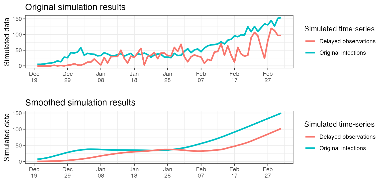
Time varying delay
Another interesting case would be simulating delayed observations affected by a time varying delay. Let us assume we now want to generate a time series of case reports, not symptom onset reports. For this we consider the observations are affected by two separate delays, one constant through time and one that varies: the delay between infection and symptom onset (constant, defined as above), and the delay between symptom onset and case report (varying through time). We assume that, in this case, for the first 30 days of our analysis the delay between symptom onset and case report follows a certain gamma distribution, and for the following days, authorities change the testing policy and this delay shortens.
  shape_onset_to_report_1 = 3.1
  scale_onset_to_report_1 = 1.8
  delay_onset_to_report_1 <- list(name="gamma",
                                shape = shape_onset_to_report_1,
                                scale = scale_onset_to_report_1)

  shape_onset_to_report_2 = 2.7
  scale_onset_to_report_2 = 1.6
  delay_onset_to_report_2 <- list(name="gamma",
                                shape = shape_onset_to_report_2,
                                scale = scale_onset_to_report_2)
The next step is to build the delay distribution matrix. The delay matrix describes the individual delay between an event and its observation, with each column corresponding to a specific day. For example, the entry on the 5th row and 2nd column will represent the probability that an event that happened on day 2, is observed on day 5. To build the delay matrix, the first step is to obtain the daily probabilities of observation corresponding to the gamma distributions described above, as a discrete vector.
  delay_distrib_1 <- build_delay_distribution(delay_onset_to_report_1)
  delay_distrib_2 <- build_delay_distribution(delay_onset_to_report_2)
Next, we will fill in the matrix, knowing that the first 30 days the delay between the event (in this case, symptom onset) and observation (case report) follows the first gamma distribution, and for the following days, the second one. The resulting delay distribution matrix will then be a lower triangular square matrix, of (at least) the same size as the incidence data.
    # Initialize empty matrix
    N <- length(simulated_infections_1)
    delay_distribution_matrix <- matrix(0, nrow = N, ncol = N)

    # Right pad the above vectors with 0, if they are shorter than the desired size of the matrix
    if (length(delay_distrib_1) < N) {
        delay_distrib_1 <- c(delay_distrib_1, rep(0, times = N - length(delay_distrib_1)))
    }

    if (length(delay_distrib_2) < N) {
        delay_distrib_2 <- c(delay_distrib_2, rep(0, times = N - length(delay_distrib_2)))
    }

    # Fill the delay distribution matrix
    for (i in 1:N) {
      if(i <= 30){
        delay_distribution_matrix[, i] <- c(rep(0, times = i - 1), delay_distrib_1[1:(N - i + 1)])
      } else {
        delay_distribution_matrix[, i] <- c(rep(0, times = i - 1), delay_distrib_2[1:(N - i + 1)])
      }
    }
The last step is to use the delay distributions defined above to generate the desired observations.
  simulated_observations_varying_delay <- simulate_delayed_observations(
    infections = simulated_infections_1,
    delay = delay_distribution_matrix,
    noise = noise
  )
Below we plot the original and smoothed results of the simulations above, alongside the original infections.
results <- data.frame(
  date = seq.Date(
    from = as.Date("01/12/2020"),
    length.out = length(simulated_infections_1),
    by = "day"),
  no_delay = simulated_infections_1,
  delay = simulated_observations_varying_delay
)

p1 <- ggplot(results, aes(x = date)) +
  geom_line(aes(y = no_delay, color = "Original infections"), lwd =  1.1) +
  geom_line(aes(y = delay, color = "Delayed observations"), lwd =  1.1) +
  scale_x_date(date_breaks = "10 days",
               date_labels = '%b\n%d') +
  ylab("Simulated data") +
  xlab("") +
  labs(colour='Simulated time-series') +
  theme(legend.position="top")+
  ggtitle("Original simulation results")+
  theme_bw()

p2 <- ggplot(results, aes(x = date)) +
  geom_line(aes(y = smooth_incidence(no_delay), color = "Original infections"), lwd =  1.1) +
  geom_line(aes(y = smooth_incidence(delay), color = "Delayed observations"), lwd =  1.1) +
  scale_x_date(date_breaks = "10 days",
               date_labels = '%b\n%d') +
  ylab("Simulated data") +
  xlab("") +
  labs(colour='Simulated time-series') +
  theme(legend.position="top")+
  ggtitle("Smoothed simulation results")+
  theme_bw()

grid.arrange(p1, p2, nrow = 2)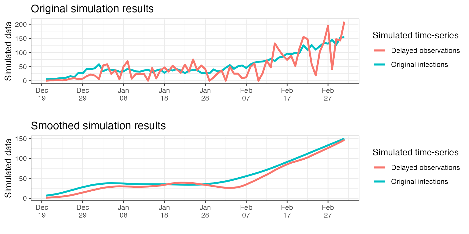
Simulating combined observations
In the following example we will describe how to simulate partially delayed and fully delayed observations, generated by the same infection time-series.
Let us assume that two delays happen between infection and case report (eg. the incubation period, between infection and onset of symptoms, and the final delay between symptom onset and case report). In a real-life scenario, in some cases we might have access to only partially delayed observations (of the date of symptom onset, not only case report date). Including this information in the analyses provides more robust results. In order to simulate such data from an underlying infection time-series, we can use the simulate_combined_observations function.
We will use the infection series simulated before, and assume the partially observed data is symptom onset data (affected by delay_incubation), and the fully delayed data represents case report data (affected by both delay_incubation and delay_onset_to_report_1). We assume that in 50% of the cases reported, we also know the date of symptom onset. We assume the same gaussian noise defined above. One can simulate such data as showed below.
combined_observations_1 <- simulate_combined_observations(
infections = simulated_infections_1,
delay_until_partial = delay_incubation,
delay_until_final_report = delay_onset_to_report_1,
prob_partial_observation = 0.5,
noise = noise
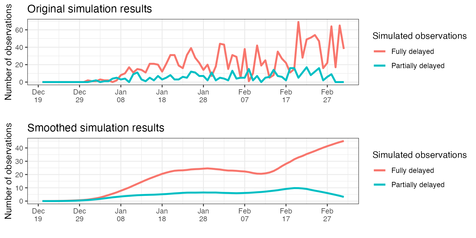
)If we plot the smoothed time-series resulted, we observe that the fully delayed observations have a peak later than partially delayed observations, as expected. Note how the number of partially delayed observations drops to zero towards the present. This happens because most partially-delayed observations that correspond to these dates have not been yet reported (the full delay has not passed yet), hence they can not be counted yet.
combined_observations_1$date <- seq.Date(
  from = as.Date("01/12/2020"),
  length.out = length(combined_observations_1$partially_delayed),
  by = "day")


p1 <- ggplot(combined_observations_1, aes(x = date)) +
  geom_line(aes(y = fully_delayed, color = "Fully delayed"), lwd =  1.1) +
  geom_line(aes(y = partially_delayed, color = "Partially delayed"), lwd =  1.1) +
  scale_x_date(date_breaks = "10 days",
               date_labels = '%b\n%d') +
  ylab("Number of observations") +
  xlab("") +
  labs(colour='Simulated observations') +
  theme(legend.position="top")+
  ggtitle("Original simulation results")+
  theme_bw()

p2 <- ggplot(combined_observations_1, aes(x = date)) +
  geom_line(aes(y = smooth_incidence(fully_delayed), color = "Fully delayed"), lwd =  1.1) +
  geom_line(aes(y = smooth_incidence(partially_delayed), color = "Partially delayed"), lwd =  1.1) +
  scale_x_date(date_breaks = "10 days",
               date_labels = '%b\n%d') +
  ylab("Number of observations") +
  xlab("") +
  labs(colour='Simulated observations') +
  theme(legend.position="top")+
  ggtitle("Smoothed simulation results")+
  theme_bw()

grid.arrange(p1, p2, nrow = 2)
If we redo the same analysis as before, but instead we assume that in only 20% of the cases reported, the date of symptom onset is known, we can also observe a difference in the total number of cases attributed to each time-series.
  combined_observations_2 <- simulate_combined_observations(
    infections = simulated_infections_1,
    delay_until_partial =  delay_incubation,
    delay_until_final_report =  delay_onset_to_report_1,
    prob_partial_observation = 0.2,
    noise = noise
  )

combined_observations_2$date <- seq.Date(
  from = as.Date("01/12/2020"),
  length.out = length(combined_observations_2$partially_delayed),
  by = "day")


p1 <- ggplot(combined_observations_2, aes(x = date)) +
  geom_line(aes(y = fully_delayed, color = "Fully delayed"), lwd =  1.1) +
  geom_line(aes(y = partially_delayed, color = "Partially delayed"), lwd =  1.1) +
  scale_x_date(date_breaks = "10 days",
               date_labels = '%b\n%d') +
  ylab("Number of observations") +
  xlab("") +
  labs(colour='Simulated observations') +
  theme(legend.position="top")+
  ggtitle("Original simulation results")+
  theme_bw()

p2 <- ggplot(combined_observations_2, aes(x = date)) +
  geom_line(aes(y = smooth_incidence(fully_delayed), color = "Fully delayed"), lwd =  1.1) +
  geom_line(aes(y = smooth_incidence(partially_delayed), color = "Partially delayed"), lwd =  1.1) +
  scale_x_date(date_breaks = "10 days",
               date_labels = '%b\n%d') +
  ylab("Number of observations") +
  xlab("") +
  labs(colour='Simulated observations') +
  theme(legend.position="top")+
  ggtitle("Smoothed simulation results")+
  theme_bw()

grid.arrange(p1, p2, nrow = 2)